Crystal Goblet Instruction Manual
Editorial 2016
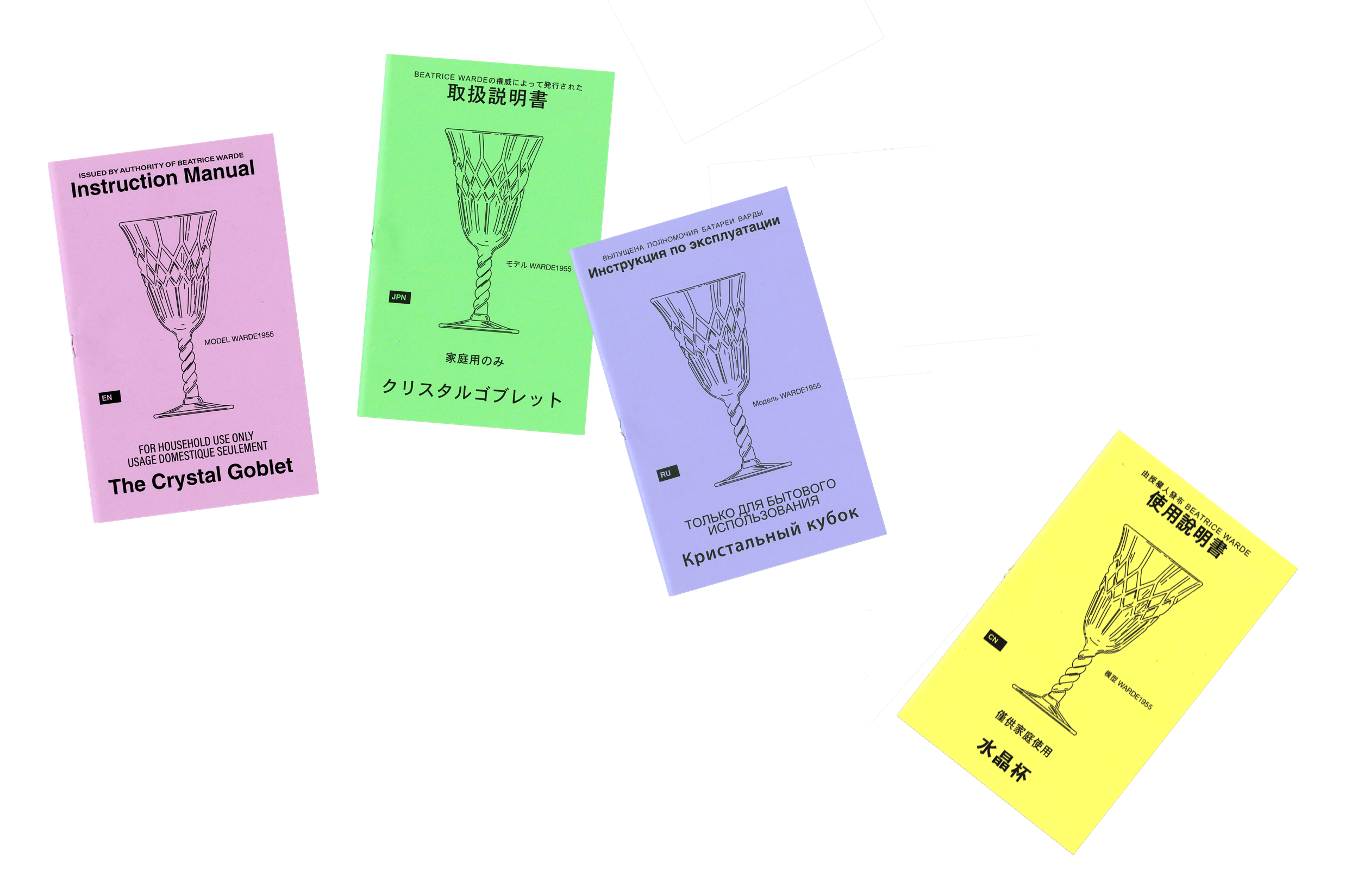
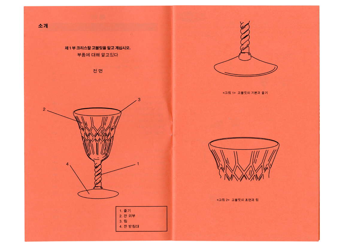
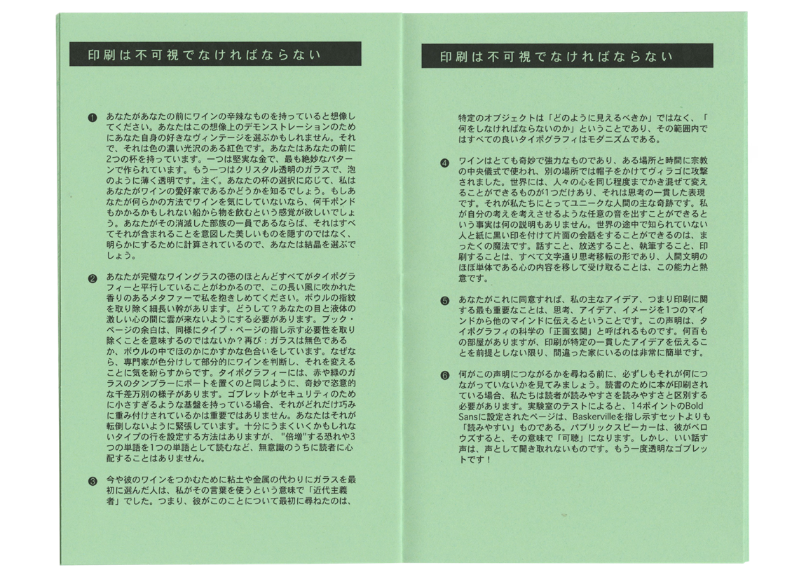
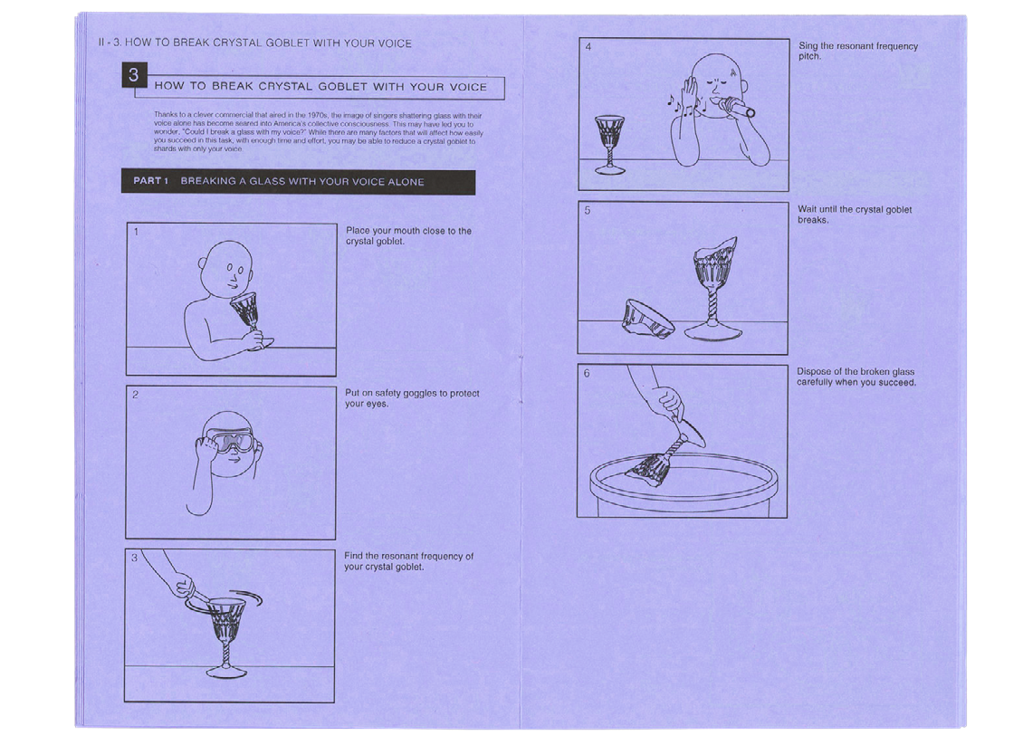
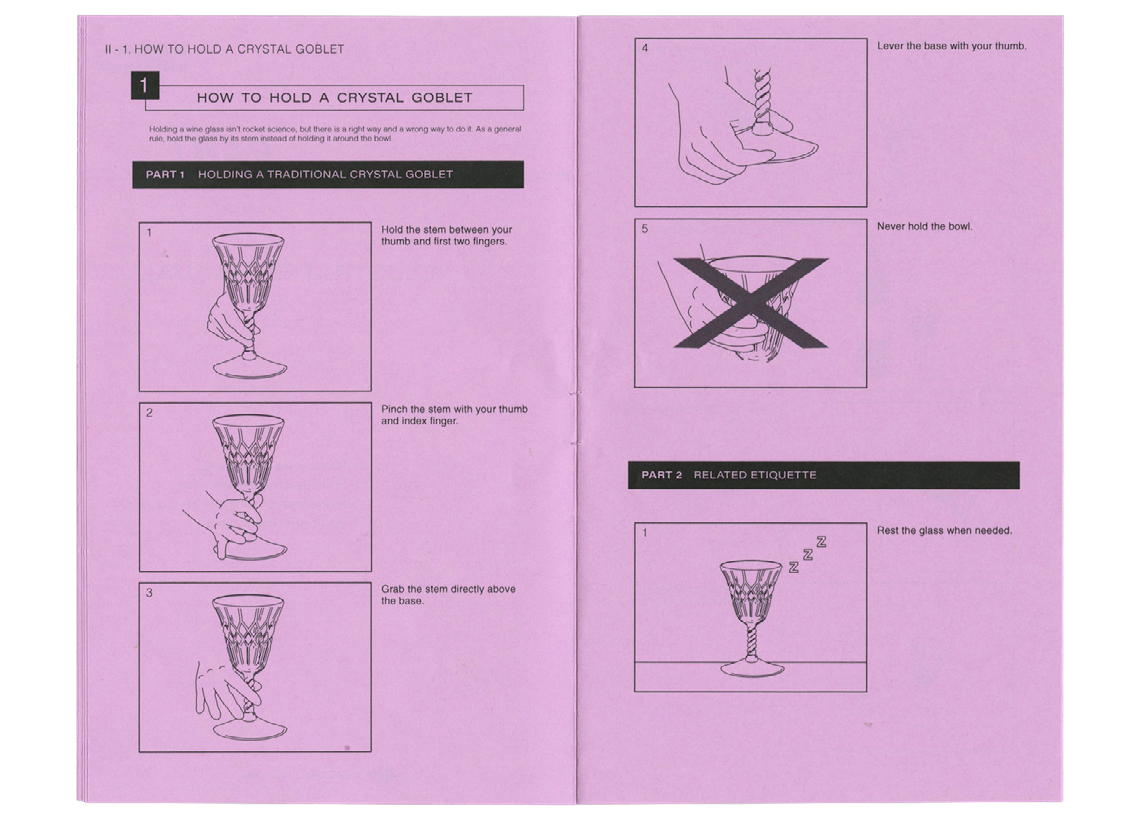
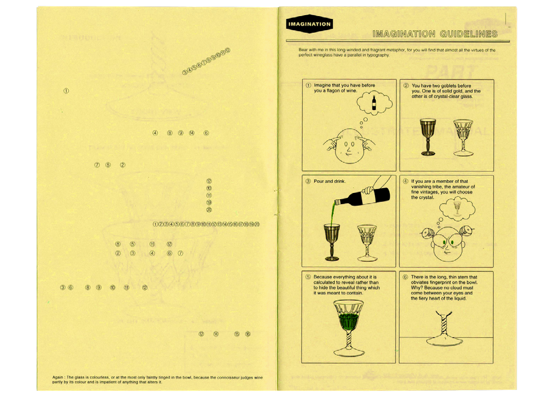
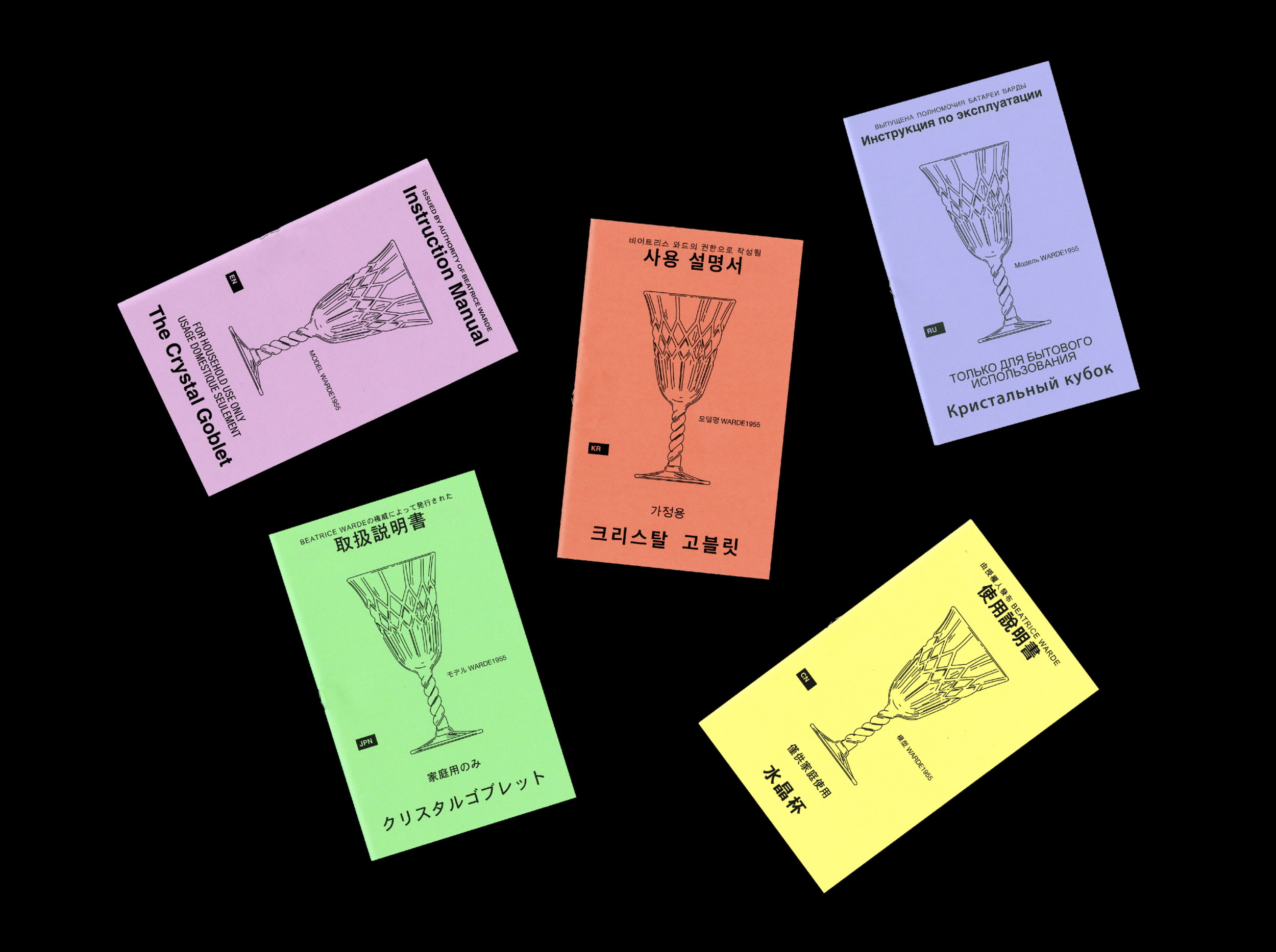
This is my respond to Beatrice Warde’s essay [The Crystal Goblet] written in 1930. The crystal gobelt instruction manual has been translated in 5 languages. English, korean, Russian, Japanese and Chinese are those, and will be translated into more other languages for wide use. The manual has 24 pages in total with staple-binding and the dimension is 4.75 in x 7.5 in. Besides the essay, there are interesting information about crysral goblet such as know the parts, imagination guidelines which helps to understand the metaphore Beatrice used in the essay. Also there are some instructions about Crystal goblet which make the manual looks real.
In the essay, Beatrice talks about the role and use of typography. She explains them using crystal goblet as a metaphor. Typography should be invisible like a crystal goblet and only function as a container of idea. She emphasizes legibility of typography and it’s function as a medium that transmits ideas. Now it’s been more than 80 years, since her essay is written. In the past, printed matter is the only vehicle that delivers ideas and information. That’s why the role and function of typography mattered at that time.
However, times have been changed. In the meanwhile, lots of medium and media have been invented such as television, telephone, radio and internet. And these enabled people to communicate faster and more convenient. Typography still plays an important role in terms of communication and information delivery. However, because of other medum, we can afford to experiment with typography going beyond it’s own function. Readers and audiences are ready to
explore typographic experiments as time changes.
